Custom Watchface Reference Document
This page is for designers of new Watchfaces. It will list all the keywords and features available when you want to create or animate a new watchface.
Custom Watchface Format
Custom Watchface is an open format designed for AAPS and associated to the new «AAPS (Custom)» watchface available on Watch.
The Watchface file is a simple zip file, but to be recognized as a Watchface file, the zip file must contain the following files:
One image file named CustomWatchface (can be bitmap files
CustomWatchface.jpg,CustomWatchface.pngor a vectorCustomWatchface.svg). This file is the little icon used to select the watchface when you click on «Load Watchface» button, and also the image visible within AAPS Wear plugin.One file named
CustomWatchface.json(see JSON structure below). This second file is the core file that will include all information required to design the watchface. This json file must be valid (it’s probably the most tricky point when you edit manually this file within a text editor, because an missing or additional comma is enough to break the json format). This JSON file must also include a"metadata"bloc with a"name"key with not empty value. This will be the name of your custom watchface (see Metadata settings below)the size of this zip should be as small as possible (less than about 500kb). If this file is too big, it will just be blocked and not transmitted to the watch.
The zip file can also contain some additional resource files:
Hardcoded file names for images that will be used used in standard views included in the watchface (like
Background,CoverChart… see List of hardcoded resource files below). All these files can be eitherjpg,pngorsvgformat. but for most of them, you will have to usepngorsvgthat manage transparency (jpg are smaller in size compared to png, but with no transparency). Note that the best quality associated to the smallest size will generally be with svg files (vector format).Addtional resource files with free names. These additional files can be either image files, or font files (
ttfandotfformat are accepted for fonts). Note that for these additional files, thefilename(without extension) will be used as the keyValue, within JSON file, to specify where or when these files should be used.image files are often used as background of text views or for dynamic animation (like battery level from 0% to 100%)
font files allow you to use dedicated fonts within your watchface
JSON Structure
JSON files can be edited in Notepad (or notepad++) text editor (prefer notepad++ that recognize JSON and use color formating)
it contains string keys
"string_key":and key values that can be strings like"key value", integer, boolean liketrueorfalseor block of data.each value is seperated by a comma
,A block of data starts by
{and ends by}the json file is a whole block so it starts by
{and ends by}, and inside this file all embeded blocks are associated to a"key"that should be unique within the blockTo improve readibility of json file, it’s generally indented (each new key is on a new line, each new block is shifted on the right by 4 spaces characters)
Metadata Settings
This block is the first block included into the json file and is mandatory. It contains all the informations associated to this watchface, like the name, the author, the date of creation or update, the author version or the plugin version.
See below an example of metadata block:
"metadata": {
    "name": "Default Watchface",
    "author": "myName",
    "created_at": "07\/10\/2023",
    "author_version": "1.0",
    "cwf_version": "1.0",
    "comment": "Default watchface, you can click on EXPORT WATCHFACE button to generate a template"
},
Note that / used for the date is a special character, so to be recognize correctly within json file, you have to put before an «escape» character \
You can see in some json file an additional key "filename", this key will be automatically created or updated when the custom watchface will be loaded within AAPS (it will be used to show to the user the zip filename within exports folder), so you can remove this key within metadata block.
General parameter settings
After the first block with metadata, you will set some general parameters (see List of general parameters below), this allow you to set Graph colors (Carbs, Bolus, BG values…), and also default colors for value in range, hyper or hypo (default colors of BG value and arrows)
See below an example of general parameters
"highColor": "#FFFF00",
"midColor": "#00FF00",
"lowColor": "#FF0000",
"lowBatColor": "#E53935",
"carbColor": "#FB8C00",
"basalBackgroundColor": "#0000FF",
"basalCenterColor": "#64B5F6",
"gridColor": "#FFFFFF",
"pointSize": 2,
"enableSecond": true,
ImageView settings
Custom image can be tuned using correct filename associated to each ImageView included into custom watchface Layout, then the json block is only here to define the position, the size, if the view is visible or not, and optionally tune the color:
See below an example of an Image block for second_hand, (in this case there are no image included into zip file so default second hand image will be used, but tuned with a custom color.
"second_hand": {
    "width": 400,
    "height": 400,
    "topmargin": 0,
    "leftmargin": 0,
    "visibility": "visible",
    "color": "#BC906A"
}
To have second_hand colored with default BG color (lowRange, midRange or highRange), you just have to modify the latest ligne with the keyValue bgColor
"color": "bgColor"
TextView settings
TexView have more available parameters compare to ImageView: you can tune rotation (integer value in degrees), textsize (integer value in pixel), gravity (to define if text value will be centered (default value), or aligned left or right), set the font, fontStyle and fontColor, and also background color of the TextView
"basalRate": {
    "width": 91,
    "height": 32,
    "topmargin": 133,
    "leftmargin": 249,
    "rotation": 0,
    "visibility": "visible",
    "textsize": 23,
    "gravity": "center",
    "font": "default",
    "fontStyle": "bold",
    "fontColor": "#BDBDBD"
},
Note that if you don’t want to manage one view within your watchface, then put the "visibility" key to "gone" but also set size and position outside visible area like that:
"second": {
    "width": 0,
    "height": 0,
    "topmargin": 0,
    "leftmargin": 0,
    "rotation": 0,
    "visibility": "gone",
    "textsize": 46,
    "gravity": "center",
    "font": "default",
    "fontStyle": "bold",
    "fontColor": "#BDBDBD"
},
If size and position are within visible area, you can get some «flash» of the hidden value during the refresh of the watchface.
If you want to customize background image of a text view, then you can use the key "background": and put the filename of image included into zip file as keyValue, you can also just change the background color using "color:" key.
"background": "fileName"
You also have 4 specific textViews (named freetext1 to freetext4) that have a specific parameter "textvalue": that can be used to set for example a label
ChartView settings
Chart view is a very specific view that can share some parameters with ImageView or with TextView…
Standard settings for this view is very simple:
"chart": {
    "width": 400,
    "height": 170,
    "topmargin": 230,
    "leftmargin": 0,
    "visibility": "visible"
},
The 2 additional parameters you can include for Chart view is a background color (default is transparent), using "color" key or a background image using "background" key.
How to build/design your first Watchface
Tools required
Text editor: my advice is to use NotePad++ (or equivalent) that is a simple text editor, but added value is you can see formated text with color code, so it’s easier to detect errors. any simple text editor do the jod. it will be used to tune json informations
Image editor (bitmap and/or vector)
If you use Bitmap
Image editor should be able to manage transparency (required for all image above background), and png format (if you used bitmap image)
Background image can be in jpg format (smaller that png)
Image editor should allow you to measure in pixel graphical objects (can be a simple square) (top, left, width, heigth)
Image editor should be able to show you colors with RRVVBB code in hexadecimal
Image editor should be able to resize image to 400px x 400px (very important to work with this resolution)
If you use Vector
Vector image should be exported in svg format
Get template to not start from scratch
When you want to design your first watchface, the best is to start by the default watchface (this will ensure you to have latest version with all available views correctly sorted)
You can get zip file by clicking on «Export Template» button within Wear plugin and get zip file within AAPS/exports folder
Note that you will need to have a watch connected to AAPS to see Custom Watchface buttons (but watch is also required to check, test and tune your custom watchface)
Default watchface is very simple and zip file will contains only the 2 files:
CustomWatchface.png (image of default watchface for WF selection)
CustomWatchface.json
Organize your files within your computer
The easiest way to work is to have phone connected to the computer, and work with to specific folders:
one explorer opened on a specific folder that will have all files (json, bitmap images, vector images, fonts), and the CustomWatchface.zip file within it
another explorer (or navigation tree tuned) opened to have Phone/AAPS/exports folder available
That way working is very easy: each time you tune json file with a text editor, image with image editor (bitmap or vector) you have to just:
save your modifications in each app
drag and drop all files within CustomWatchface.zip file
drag and drop CustomWatchface.zip into AAPS/exports folder of the phone
send CustomWatchface to the watch to check the results
Initialize Watchface customization
First step you will have to define a watchface Name (necessary to select it easily for testing), and start to tune metadata keys at the begining of json file
Then you will have to define which information you want to show so which view should be visible or hidden.
will you manage second or not?
do you want to design an analog watch or a digital watch (or both…)
Now you can start to modify json file with the "visibility": key of each view set to "visible" or "gone" (if you want to keep or not the view)
You can also start to tune approximativaly top, left margin and width heigth values to start organizing the watchface (these values will be tuned later using image editor)
Note: everything is design within a 400px x 400px rectangle. So everything will be position in absolute coordinates within this size.
When you design your first watchface, you have to know that everything is organized by layer from the Back to the Top, so each view (ImageView or TextView) can hide something that is behind…
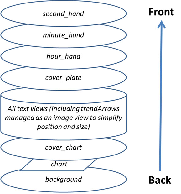
Then within json file all views are sorted from the Back to the Top (this will help you to remember what is behind what…)
If you design or tune your first custom watchface, start by simple things: change visibility of some views, include a dedicated background image without changing json file…
Manage colors
Within json file, you will have several keys to specify colors: "color", "fontColor"for views, but also "highColor", "midColor", "lowColor", … (see List of General Parameters)
Colors are specified with a text field that starts by # followed by RRGGBB (Red, Green, Blue) values in hexadecimal format:
"#FFFFFF"is white, and"#000000"is black,"#FF0000"is red…
You can also include 2 additional values for alpha layer and specify a transparency level (AARRGGBB):
"#00000000"is completly transparent, and"#FF000000"is completly opaque ( so"#FF000000"is equivalent to"#000000")
You can also use the specific keyvalue "bgColor" to automatically use "highColor", "midColor", "lowColor" specified in general parameters according to BG Value:
"fontColor": "bgColor",will automatically set the font color of the view according to BG ValueNote that
sgv(for BG Value) anddirection(for trend arrow) views automatically apply BG colors set into general parameters (for these 2 views, if you want to have different colors, you will have to use advanced dynData feature with one step color…)
For more information concerning ImageViews and "color": key, see dedicated chapter Tune image color below.
Include Hardcoded images
the easiest way to start tuning your watchface is to include within zip file some images with a specific names (see List of Hardcoded resource files)
Image should be in
.jpg,.pngor.svgformat. but be carefull, jpg doesn’t manage transparency, so should be only used for background layer. For all intermediate layers (cover_chart, cover_plate, hands) use eather.pngor.svgimageIf you have a vector image editor (like for example Illustrator), prefer this format that will produce small text files with
.svgextension the best quality.You should take care to use exact filename (including High/lower case)
Now if you want a dedicated backgoung image, you only have to include within the zip file a file named Background.jpg (without changing anything else. send zip file into the watch and check result!.
If you want to customize hour_hand, minute_hand or second_hand for an analog watch, simply include HourHand.png (or HourHand.svg), MinuteHand.png and SecondHand.png.
these images will automatically rotate around the center of the image, so the images should be set to 00:00:00 (and for a «full frame» analog watch, use a size of 400 x 400 px positioned at top 0 left 0)
You can also noticed within List of Hardcoded resource files that for each image view, you have two additional hardcoded filenames High and Low (for example you can include other images named BackgroundHigh.jpg and BackgroundLow.jpg within zip file). then image will automatically change according to you BG level (within Range, Hyper or Hypo). See AIMICO watchface as example.
Tune image color
"color" key can be used to tune default image color:
applied on background view, it will set the background color (default black)
applied on cover_plate (simple dial) or hands, it will change the default image (white) by the color specified (including
"bgColor")
When you apply "color" key on a bitmap image (.jpg or .png), color will apply an interresting effect on color saturation. So you will still recognize your bitmap.
Finally on .svg image file, "color"key will have no effect, consider color of vector files as hardcoded within the image. If you want to change colors, you will have to include several svg files, and use advanced dynData feature to change it
Use additional fonts for TextViews
Several defaults font are already available within wear apk (see font keys included into key values chapter). But if you want to use additional fonts not available as default, you can include addtional fonts within zip file:
the 2 accepted font format are
.ttfand.otffilesif you include a custom font within zip file, for example with a file named
myCustomFont.ttf, then you will have to use the filename to use it within json file for a TextView:
"font": "myCustomFont",
Keep in mind that some fonts can be included into big files (and you are limited to a maximum size for zip file). So if you only use very few characters (numbers, ., ,), you can use free tools to remove unused characters (for example here) and then reduce font size.
Advanced features
Preferences Feature
CustomWatchface can automatically tune some watch preferences to have the correct visualization of the watchface (if authorization is given within Wear preferencesby the user).
But this feature should be used with care. Preferences are common with all other watchfaces. So several rules to respect with this feature:
never set preferences concerning hidden views
try to maximize the visible views
feel free to oversize the width of certain views:
TBR can be shown as percentage (small width, but also as absolue values much wider)
delta or avg delta with detailed information can be wide
same for iob2: this view can have total iob, but if detailed iob is selected, then text size can be very long
If you still need some very specific settings to have a correct display (in example below, if there is not enough space for detailed iob, you can «force» this parameter to false of your watch, you can include within metadata block some settings constraint like that
"metadata": {
    "name": "Default Watchface",
    "author": "myName",
    "created_at": "07\/10\/2023",
    "author_version": "1.0",
    "cwf_version": "1.0",
    "comment": "Default watchface, you can click on EXPORT WATCHFACE button to generate a template",
    "key_show_detailed_iob": false
},
If user authorize custom watchface to modify watch parameter (setting within wear plugin) then Show detailed iob will be set to «disable», and locked to disable (no modification of this parameter possible, until authorization is disabled within wear plugin parameter, or another watchface is selected)
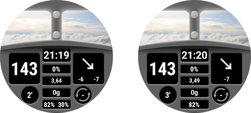
Note that when a user select a watchface, he can see the number of «required parameter» during watchface selection
In example below Gota watchface has one required parameter. If authorization is not given it will be shown in white color, but authorization is given, then this parameter will be set and locked on the watch (in this case the number is in orange color)
TwinView Feature
Twin views provide an easy way to adjust the view position based on the visible views. This does not have the power of a layout entirely made up of LinearLayout, but can handle many common cases.
In example below you can see AAPS (Cockpit) watchface with all views visible within settings, and the same watchface with «Show rig battery» disabled and «Show avg delta» disabled
You can see that when one of the twin views is hidden, the other is shifted to be centered
in this example, you can see that within "uploader_battery" block, we have "twinView": key is added to define "rig_battery" view, and in "rig_battery" block "twinView": key define "uploader_battery" as twin. Then then additional key "leftOffsetTwinHidden": define the number of pixel to shift the view when twin is hidden.
To calculate this number, you can see that the difference between the leftMargin of each of the twin views is 50 pixels, so the offset to stay centered is half in one direction or the other.
If the twin views are positioned vertically, in this case you must use the key "topOffsetTwinHidden":
"uploader_battery": {
    "width": 49,
    "height": 30,
    "topmargin": 354,
    "leftmargin": 150,
    "rotation": 0,
    "visibility": "visible",
    "textsize": 23,
    "gravity": "center",
    "font": "roboto_condensed_bold",
    "fontStyle": "bold",
    "fontColor": "#FFFFFF",
    "twinView": "rig_battery",
    "leftOffsetTwinHidden": 25
},
"rig_battery": {
    "width": 49,
    "height": 30,
    "topmargin": 354,
    "leftmargin": 200,
    "rotation": 0,
    "visibility": "visible",
    "textsize": 23,
    "gravity": "center",
    "font": "roboto_condensed_bold",
    "fontStyle": "bold",
    "fontColor": "#FFFFFF",
    "twinView": "uploader_battery",
    "leftOffsetTwinHidden": -25
},
DynData Feature
DynData is the most powerfull feature if you want to include some animation within you watchface, according to some internal values (like BG value, BG level, delta, % of battery… see list of available data here)
To illustrate this feature, I will take the example of AAPS (SteamPunk) watchface:
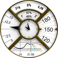
In this watchface, we will have to manage the rotation of BG value (from 30 degrees to 330 degrees) on the right, the dynamic range of avg_delta (scale up to 5mgdl, 10mgdl or 20mgdl according to value), the rotation of pointer that should be synchronized to the scale, and also the different layer of the views…
To be able to manage this Watchface, see below all the images included into the zip file:
Note: to be able to see the transparency, all these images are on a yellow background and surrounded by a red square
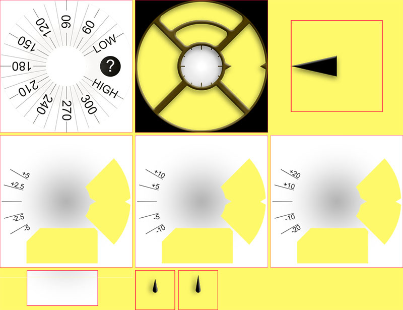
On the first row, Background.jpg and CoverPlate.png will be automatically mapped with associated view (default views filename), and steampunk_pointer.png will be managed by dynData
On the second row you see the 3 scales of dynamic range for avg_delta that will also be managed by dynData
On the third row, chartBackground.jpg will be linked manually within chart view, HourHand.png and finally MinuteHand.png files will be automatically mapped with associated views
Background management
First, concerning BG value image, no choice here, it can only be in the background layer (otherwize it will be in front of the chart view and chart will not be visible!). So we will have to map BG value to the background, and then rotate background image according to BG value.
Within "background" block, we will include 2 dedicated keys to make this rotation:
"background": {
    "width": 400,
    "height": 400,
    "topmargin": 0,
    "leftmargin": 0,
    "dynData": "rotateSgv",
    "rotationOffset": true,
    "visibility": "visible"
},
"dynData": key will define which block should be used to define the animation (value, range, convertion…) here this block was named «rotateSgv» (choose an explicit name when you use this feature),
"rotationOffset": true, will define that the expected animation according to value should be a rotation. (others available keys are "leftOffset" and "topOffset" if you want to create a slider)
Now we will go at the end of the file, after the last view:
"second_hand": {
    "width": 120,
    "height": 120,
    "topmargin": 140,
    "leftmargin": 140,
    "visibility": "gone"
},
"dynData": {
    "rotateSgv": {
        "valueKey": "sgv",
        "minData": 30,
        "maxData": 330
    },
You can see that after the latest view ("second_hand"), we added a new "dynData": { ... } block that will contains all the animations:
The block defined within "background"view was named "rotateSgv", it’s the first block you will find into "dynData"!
This block is simple: you have a first key named "valueKey": that will be used to define which value should be used. in this case "sgv" is a «keyValue» that defines BG value (note that in most cases the keyValue has the same name that the view that shows this information).
Concerning BG value, default min data is set to 39mgdl and max data is set to 400mgdl (see DynData reference key values below all available keyValues and associated min/max data values).
Within "rotateSgv" block the two additional keys ("minData": and "maxData":) will be used to tune min and max data to 30 and 330. With these min and max values, we will be able to directly use data value (without any convertion) to rotate background in degrees. In this situation all BG values above 330mgdl will be limited to 330, upper limit of the image.
Chart management
Default background of chart is transparent, so to hide BG scale included into background image, we will need to include a dedicated background image (this image will include the overall shadows of Steampunk watchface). The link to charBackground.jpg file is done with "background": key
Of course, the sizing and positioning of the view must be done to the pixel!
"chart": {
    "width": 216,
    "height": 107,
    "topmargin": 280,
    "leftmargin": 80,
    "visibility": "visible",
    "background": "chartBackground"
},
Avg delta management
To be able to manage dynamic range of avg delta, we will use the four freetext views. freetext1 will be used to manage the image scale, and freetext2 to freetext4 will be used to manage pointer rotation according to scale.
freetext1
As explain before, freetext views are in front of chart and in front of background, that’s why we included transparent area to see these images (right side and bottom side of the image)
Note that the removed bottom part of these images has been used as background of chart to have a perfect integration.
"freetext1": {
    "width": 400,
    "height": 400,
    "topmargin": 0,
    "leftmargin": 0,
    "rotation": 0,
    "visibility": "visible",
    "dynData": "avgDeltaBackground"
},
For this view we include the link to another "dynData"block named avgDeltaBackground. This block will manage avgDelta scale according to avgDelta value.
"avgDeltaBackground": {
    "valueKey": "avg_delta",
    "minData": -20,
    "maxData": 20,
    "invalidImage": "steampunk_gauge_mgdl_5",
    "image1": "steampunk_gauge_mgdl_20",
    "image2": "steampunk_gauge_mgdl_20",
    "image3": "steampunk_gauge_mgdl_10",
    "image4": "steampunk_gauge_mgdl_5",
    "image5": "steampunk_gauge_mgdl_5",
    "image6": "steampunk_gauge_mgdl_10",
    "image7": "steampunk_gauge_mgdl_20",
    "image8": "steampunk_gauge_mgdl_20"
},
"valueKey":will make the link with"avg_delta"valuemin and max Data will also limit the range to the maximum value available within this watchface (from -20mgdl to 20mgdl). For mmol users, keep in mind that all internal values are always in mgdl within AAPS.
Then we will see here how to manage dynamic background image according to value.
"invalidImage": is the key to manage image to show when we have an invalid data (or missing data). Here we make the link to additional resource image including into zip file with 5 mgdl scale
Then we will use a serie of images, starting from "image1": to "image8":. The number of provided images will define the number of steps between minData and maxData.
image1will define image to show when avg_delta is equal or close tominDataand the image with the highest number (hereimage8) will be used to define the image that should be shown when avg_delta is equal or close tomaxDatabetween -20mgdl and 20mgdl, the overall range is 40mgdl, devided by 8 (number of images provided), we will have 8 steps of 5mgdl
Now we can map background images according to avg_delta value, starting from the lowest values: between -20 and -15, and also between -15 and -10 we will use
steampunk_gauge_mgdl_20for the scale, then between -10 and -5steampunk_gauge_mgdl_10, and so on until +15 and +20 where we will again usesteampunk_gauge_mgdl_20background image
freetext2 to freetext4
For these views will will combine dynamic images and rotation feature explained before:
"freetext2": {
    "width": 276,
    "height": 276,
    "topmargin": 64,
    "leftmargin": 64,
    "rotation": 0,
    "visibility": "visible",
    "dynData": "avgDelta5",
    "rotationOffset": true
},
"freetext3": {
    "width": 276,
    "height": 276,
    "topmargin": 64,
    "leftmargin": 64,
    "rotation": 0,
    "visibility": "visible",
    "dynData": "avgDelta10",
    "rotationOffset": true
},
"freetext4": {
    "width": 276,
    "height": 276,
    "topmargin": 64,
    "leftmargin": 64,
    "rotation": 0,
    "visibility": "visible",
    "dynData": "avgDelta20",
    "rotationOffset": true
},
Here each view is dedicated to a specific scale (so is linked to a dedicated dynData block), you can alos notice that "rotationOffset": key is enabled for these 3 views.Now take a look on the first dynData block:
"avgDelta5": {
    "valueKey": "avg_delta",
    "minData": -20,
    "maxData": 20,
    "rotationOffset": {
        "minValue": -120,
        "maxValue": 120
    },
    "invalidImage": "null",
    "image1": "null",
    "image2": "null",
    "image3": "null",
    "image4": "steampunk_pointer",
    "image5": "steampunk_pointer",
    "image6": "null",
    "image7": "null",
    "image8": "null"
},
Here, even if dynamic range will be used only between -5 and +5 avg_delta datas, it’s important to keep the overall range of -20, +20mgdl to ensure that the pointer will be synchronize with the background during scale switches. That’s why we keep the same overall range than for avgDeltaBackground and the same number ot steps (8 images).
You can note that either "invalidImage" or several "imagexx" are with "null" key value (it could be any string not existing as a filename within zip file). When a filename is not found, then view background image will be transparent. So the setting ensure that pointer will only be visible for step 4 and step 5 (avg delta between -5mgdl and +5 mgdl), and will not be visible outside this range.
Now we can see a new block "rotationOffset": that will have inside two keys "minValue": and "maxValue":. These values are used to make the convertion between internal datas (in mgdl), and the angle rotation we want to have.
Steampunk watchface is designed to have maximum from -30 degrees to 30 degrees rotation for the pointer. So according to the scale (here from -5mgdl to 5mgdl), we will want to have 30 degrees for these values. Because
minDataandmaxDataare 4 times greater, then the corresponding minValues and maxValues are 4 * 30 degrees so -120 and +120 degrees. But for all rotation above or below +-30 degrees the pointer will be hidden (no image visible), and the pointer will only be visible for values between -5 and +5mgdl… So it’s exactly what is expected here.
The other dynData blocks are defined the same way to tune "avgDelt10"and "avgDelta20"
loop view
in Steampunk watchface loop green and red arrows (for status) are disabled, this is also managed with a dedicated dynData block associated to loop view.
    "loopArrows": {
        "invalidImage": "greyArrows",
        "image1": "greenArrows",
        "image2": "redArrows"
    }
Because this block is only called by loop View, and default data managed by this view is loop information, then "valueKey": key is optional.
Default minData and maxData for loop are defined to 0min and 28min, so with two images, all data values below 14 min will be shown with background image1 and all data values above 14 min will be shown with image2. 14 min is exactly the threshold to switch from green arrow to red arrow.
In this example, greyArrows, greenArrows and redArrows files are not included into zip file, so these arrows are just removed (invisible), but you can use this block «as is» if you want to tune status arrows with custom background images.
rig_battery and uploader_battery views
To finish the overview of dynData feature, we will take a look on battery management. The idea here is to customize text color according to battery level (from 0 to 100%)
"uploader_battery": {
    "width": 60,
    "height": 28,
    "topmargin": 100,
    "leftmargin": 170,
    "rotation": 0,
    "visibility": "visible",
    "textsize": 20,
    "gravity": "center",
    "font": "default",
    "fontStyle": "bold",
    "fontColor": "#00000000",
    "dynData": "batteryIcons",
    "twinView": "rig_battery",
    "topOffsetTwinHidden": -13
},
"rig_battery": {
    "width": 60,
    "height": 28,
    "topmargin": 74,
    "leftmargin": 170,
    "rotation": 0,
    "visibility": "visible",
    "textsize": 20,
    "gravity": "center",
    "font": "default",
    "fontStyle": "bold",
    "fontColor": "#00000000",
    "dynData": "batteryIcons",
    "twinView": "uploader_battery",
    "topOffsetTwinHidden": 13
},
You can see here that these both views share the same dynData block named batteryIcons. It’s possible because by default attached data is the one of the view (to without specifying a "valueKey": key within batteryIcons block, it will be applied with uploader_battery data or rig_battery data according to the view).
Note these two views also use TwinView feature explain here.
Now lets take a look on dynData block:
"batteryIcons": {
    "invalidFontColor": "#00000000",
    "fontColor1": "#A00000",
    "fontColor2": "#000000",
    "fontColor3": "#000000",
    "fontColor4": "#000000",
    "fontColor5": "#000000"
},
Here we use exactly the same logic that for dynamic background image, but with dedicated keys ("invalidFontColor" and "fontColor1" to "fontColor5" to specify 5 steps of 20% each one).
"fontColor1"(dark red) will be used for all values below 20%, and white will be used for all values above this threshold.If you want to lower the threshold to «below 10%», you just have to add 5 additional keys from
"fontColor6"to"fontColor10", but you can also adjust each color if you want progressive variation from green to yellow, orange and red…
DynPref Feature
Before reading this chapter, you have to understand how dynData works, because DynPref is an advanced usage of DynData: You will now be able to adjust each DynData block according to preferences set by the user:
To illustrate DynPref feature, we will use two example:
Steampunk watchface (simple use to include into the same watchface mgdl and mmol version, watchface will automatically switch according to unit selected into aaps).
AAPS V2 watchface will combine different preferences to be able to manage text color and background according to dark and match divider preferences.
Simple usage of dynPref within Steampunk watchface
Within Steampunk, we have to set of images according to units: background image that will have BG scale and will turn according to BG value. and freeText1 that contains dynamic scale according to avgDelta value.To be able to have one watchface that will automatically show correct units, we should select image according to unit selected.
To do that we will replace dynData key by a dynPrefkey within view block:
 "background": {
    "width": 400,
    "height": 400,
    "topmargin": 0,
    "leftmargin": 0,
    "dynPref": "rotateSgv",
    "rotationOffset": true,
    "visibility": "visible"
},
Usage of dynPrefkeys will be very close to dynDatakeys explained in previous chapter
Now we will take a look at the end of the json file, after dynData block:
"dynData": {
    ...
},
"dynPref": {
    "rotateSgv": {
        "prefKey": "key_units",
        "true": {
            "valueKey": "sgv",
            "minData": 30,
            "maxData": 330,
            "invalidImage": "Background_mgdl",
            "image1": "Background_mgdl"
        },
        "false": {
            "valueKey": "sgv",
            "minData": 30,
            "maxData": 330,
            "invalidImage": "Background_mmol",
            "image1": "Background_mmol"
        }
    },
    ...
}
You can see that the dynpref key defined within background view block ("dynPref": "rotateSgv") exists into the dynPref json block included at the end of json file:
This block should contains a "prefKey"key that will define which preference should be used. In this example the key "key_units" is linked to units selected within AAPS on phone, and value is "true"if selected unit is mgdl, "false"if selected unit is mmol.
Then you will find two json blocks that will use «dynData» format, and that will be used according to selected preference
Note that the «HardCoded» file name for Background image is now replaced by a dynamic image that will be the same wathever the BG value (Background_mgdl.pngfile if key_units is «true», Background_mmol.png if key_units is false), and we also include an `»invalidImage» key to allways have a background image even if no data has been received from the phone.
Combine different preferences within dynPref with AAPS V2
Most of the time, when you set a preference, it’s not to get «dynamic behaviour», but only the results according to what you select, but within dynPref, it’s considered as a dynamic feature…
when in
dynDatayou specify one full block of parameters (with images, fontColor, Color, …), withdynPref, you will be able to combine each parameter according to one specific preference.Here we will see how match devider preference will be associated to dark preference to show when it’s enabled (true) white text on black background on dark watchface (dark parameter true) or black text on white background on light watchface (dark false)…
First lets see the beginning of json file:
"dynPrefColor": "prefColorDark",
"pointSize": 2,
"enableSecond": false,
"background": {
    "width": 400,
    "height": 400,
    "topmargin": 0,
    "leftmargin": 0,
    "visibility": "visible",
    "dynPref": "dark"
},
"dynPrefColor": "prefColorDark" will specify the dynPref block of all default colors outside views. These colors will be tuned according to dark parameter within "prefColorDark":
And at the end, within the dynPref block, you will have a specific dynPref block for default colors:
"prefColorDark": {
    "prefKey": "key_dark",
    "true": {
        "highColor": "#FFFF00",
        "midColor": "#00FF00",
        "lowColor": "#FF0000",
        "lowBatColor": "#E53935",
        "carbColor": "#FB8C00",
        "basalBackgroundColor": "#0000FF",
        "basalCenterColor": "#64B5F6",
        "gridColor": "#FFFFFF"
    },
    "false": {
        "highColor": "#A0A000",
        "midColor": "#00A000",
        "lowColor": "#A00000",
        "lowBatColor": "#E53935",
        "carbColor": "#D07C00",
        "basalBackgroundColor": "#0000A0",
        "basalCenterColor": "#64B5F6",
        "gridColor": "#303030"
    }
}
The difference between this dynPref block and the other standard dynPref blocks used for views is that here you don’t have a dynData block for each value of "key_dark" parameter, but only the list of main colors (highColor, midColor , …)
Lets now take a look on items included into the «divider banner» (in example below "basalRate" view linked to "matchDivider" dynPref view:
"basalRate": {
    "width": 90,
    "height": 32,
    "topmargin": 127,
    "leftmargin": 242,
    "rotation": 0,
    ...
    "leftOffsetTwinHidden": 33,
    "dynPref": "matchDivider"
},
Then within dynPref block, you can see that Match divider parameter (key_match_divider key), include the 2 blocks «true» and «false», but these two blocs are only used to define that view will use either «dark» dynBlock (so exactly the same background and text color than the otherviews outside the banner), or «white» dynBLock that will set opposite colors for background and text…
"matchDivider": {
    "prefKey": "key_match_divider",
    "true": {
        "dynPref": "dark"
    },
    "false": {
        "dynPref": "white"
    }
},
"dark": {
    "prefKey": "key_dark",
    "true": {
        "color1": "#000000",
        "fontColor1": "#FFFFFF"
    },
    "false": {
        "color1": "#FFFFFF",
        "fontColor1": "#000000"
    }
},
Note that here you are within a «dynData» block, then to define a color or a fontColor, you will use a dynData (not specified here), and a single step ("color1" and 'fontColor1' are used)
for all parameter other than
imagedefault «invalid value (if not set specifically by"invalidColor"key or"invalidFontColor"keys) will be"color1"and"fontColor1".
Then we will see a third example with iob views (iob1 and iob2), where we will use smaller text for detailled iob and bigger text for total iob:
"iob1": {
    "width": 125,
    "height": 33,
    "topmargin": 168,
    "leftmargin": 275,
    "rotation": 0,
    "visibility": "visible",
    "textsize": 19,
    ...
    "dynPref": "prefIob1"
},
"iob2": {
    "width": 125,
    "height": 33,
    "topmargin": 196,
    "leftmargin": 275,
    "rotation": 0,
    "visibility": "visible",
    "textsize": 24,
    ...
    "leftOffsetTwinHidden": -10,
    "dynPref": "prefIob2"
},
You will see within default view settings the text size (19 on iob1 and 24 on iob2) and the two different dynPref block that should tune textsize (according to detailed iob parameter), and colors (according to dark parameter)
"prefIob1": {
    "prefKey": "key_show_detailed_iob",
    "true": {
        "dynPref": "dark",
        "textsize1": 24
    },
    "false": {
        "dynPref": "dark"
    }
},
"prefIob2": {
    "prefKey": "key_show_detailed_iob",
    "true": {
        "dynPref": "dark",
        "textsize1": 19
    },
    "false": {
        "dynPref": "dark"
    }
},
You can see here that according to detailed iob parameter ("key_show_detailed_iob" key), when it’s «true» then textsize is defined to a fix value bigger than default (24 instead of 19): this is done using textsize «step» feature, within only one value so one step… (note that for all parameter others than images,if invalidTextSize is not set, then textsize1 will be used for invalid data)
Then «dark» dynPref block will be used to set colorand fontColor
In this example the dynData block that will be used for iob1 view will be if detailed IOB is enabled and dark enabled:
{
    "color1": "#000000",
    "fontColor1": "#FFFFFF",
    "textsize1": 24
},
So the text will be inwhite on black background and the size 24 will replace default size of 19 set into the view
The dynData block that will be used for the same view iob1 if detailed IOB is disabled and dark disabled will be:
{
    "color1": "#FFFFFF",
    "fontColor1": "#000000"
},
Now the text will be in black on white background with a size of 19
Tips and tricks for dynPref
You can combine as many pref than you want, but be carefull, the number of blocks to describe can increase very fast (it’s exponential): if you chain 3 parameters and you want to define all situations, you will have 8 blocks to describe, if each parameter has only 2 values…
Be carefull to not build «infinite loop» (for example if dynpref1 block should be completed by dynpref2 block that should be completed by dynpref1 block…). In this case the dynpref blocks will be considered as invalid…
Do not forget to include the numéric index after the key (when you use for example
"textsize"key within a view, you will have to use"textsize1"within the dynPref value block, because it’s a «dynData» format, so linked to value with a single step in this case)Only one key
"valueKey"should be set for one view, so if the finaldynDatablock is built from severaldynPrefblocks, do not include several"valueKey"(and associated"minData","maxData", …)
Key and KeyValue reference
List of Metadata keys
List of Standard information metadata keys
Key |
Comment |
|---|---|
name |
Name of custom watchface |
author |
Name or pseudo of the author(s) |
created_at |
Creation (or update) date, be carefull |
cwf_version |
Watchface plugin compatible with the design of your watchface |
author_version |
The author can specify here the version of his watchface |
comment |
Free text that can be used to give some information or limitation of current watchface |
Preference keys
Key |
Comment and |
|---|---|
key_show_detailed_iob |
true will lock detailed IOB data on view |
key_show_detailed_delta |
false (only if design is not compatible with the width of detailed delta for |
key_show_bgi |
true if your design requires |
key_show_iob |
true if your design requires |
key_show_cob |
true if your design requires |
key_show_delta |
true if your design requires |
key_show_avg_delta |
true if your design requires |
key_show_uploader_battery |
true if your design requires |
key_show_rig_battery |
true if your design requires |
key_show_temp_basal |
true if your design requires |
key_show_direction |
true if your design requires |
key_show_ago |
true if your design requires |
key_show_bg |
true if your design requires |
key_show_loop_status |
true if your design requires |
key_show_week_number |
true if your design requires |
key_show_date |
true if your design requires |
Internal keys
Key |
Comment and |
|---|---|
filename |
This key will be created (or updated) automatically when the watchface is loaded and will contains local zip filename within exports folder |
cwf_authorization |
this key will be created (when the watchface is loaded) and updated each time authorization preference is changed in Wear settings, and it will be used to synchronize authorization to watch |
List of General parameters
Key |
Comment |
|---|---|
highColor |
|
midColor |
|
lowColor |
|
lowBatColor |
|
carbColor |
|
basalBackgroundColor |
|
basalCenterColor |
|
gridColor |
|
pointSize |
2 (default): size of points in graph (1 for small point, 2 for big points) |
enableSecond |
false (default): specify if watchface will manage seconds or not within |
dayNameFormat |
«E» (default): from «E» to «EEEE» specify dayname format (number, short name, full name) tbc |
monthFormat |
«MMM» (default): from «M» to «MMMM» specify month format (number, short name, full name) |
List of HardCoded resource files
For most images, High and Low suffix allow tuning of image according to BG level (in Range, Hyper or Hypo)
Filenames |
Comment |
|---|---|
CustomWatchface |
Image shown for watchface selection and within Wear plugin |
Background, |
none (default black): Background image. background is allways visible and default color is black if no image provided. Color can be modified to fit watchface design |
CoverChart, |
none (default): Image in front of Chart (transparency should be available to see Chart behind) Can be used to limit boundaries of graph |
CoverPlate, |
simple dial (default): image in front of all text values. transparency mandatory to see all values that are behind |
HourHand, |
hour_hand (default): image of hour hand. a default image is provided and can be colored to fit analog design. Note axis for rotation will be the center of the image |
MinuteHand, |
minute_hand (default): image of minute hand. a default image is provided and can be colored to fit analog design. Note axis for rotation will be the center of the image |
SecondHand, |
second_hand (default): image of second hand. a default image is provided and can be colored to fit analog design. Note axis for rotation will be the center of the image |
ArrowNone |
?? (default): image shown when no valid arrow is available. |
ArrowDoubleUp |
↑↑ (default): image of double arrow up |
ArrowSingleUp |
↑ (default): image of single arrow up |
Arrow45Up |
↗ (default): image of fortyfive arrow up |
ArrowFlat |
→ (default): image of flat arrow |
Arrow45Down |
↘ (default): image of fortyfive arrow down |
ArrowSingleDown |
↓ (default): image of single arrow down |
ArrowDoubleDown |
↓↓ (default): image of double arrow down |
For each above filenames, extension can be either .jpg, .png or .svg. But be carefull, .jpgdoesn’t manage transparency (so most of the files should be with .png or .svg to not hide view that are behind…)
List of View keys
This list is sorted from background to foreground this is very important when you organize your watchface to know this order because some image or text can be hidden by other images
Key |
Type of view |
Data attached |
DynData Key |
|---|---|---|---|
background |
Image View |
||
chart |
Specific Chart View |
Graphical curves |
|
cover_chart |
Image View |
||
freetext1 |
Text View |
||
freetext2 |
Text View |
||
freetext3 |
Text View |
||
freetext4 |
Text View |
||
iob1 |
Text View |
IOB label or IOB Total |
|
iob2 |
Text View |
IOB Total or IOB Detailed |
|
cob1 |
Text View |
Carb label |
|
cob2 |
Text View |
COB Value |
|
delta |
Text View |
Short delta (5 min) |
delta |
avg_delta |
Text View |
Avg Delta (15 min) |
avg_delta |
uploader_battery |
Text View |
phone battery level (%) |
uploader_battery |
rig_battery |
Text View |
rig battery level (%) |
rig_battery |
basalRate |
Text View |
% or absolute value |
|
bgi |
Text View |
mgdl/(5 min) or mmol/(5 min) |
|
time |
Text View |
HH:MM or HH:MM:SS |
|
hour |
Text View |
HH |
|
minute |
Text View |
MM |
|
second |
Text View |
SS |
|
timePeriod |
Text View |
AM or PM |
|
day_name |
Text View |
name of the day (cf. dayNameFormat) |
day_name |
day |
Text View |
DD date |
day |
week_number |
Text View |
(WW) week number |
week_number |
month |
Text View |
month name (cf. monthFormat) |
|
loop |
Text View |
min ago since last run and status (color arrows in background), color arrows can be tuned with DynData |
loop |
direction |
Image View |
TrendArrows |
direction |
timestamp |
Text View |
integer (min ago) |
timestamp |
sgv |
Text View |
sgv value (mgdl or mmol) |
sgv |
cover_plate |
Image View |
||
hour_hand |
Image View |
||
minute_hand |
Image View |
||
second_hand |
Image View |
List of Json keys
Common keys
that can be used on all view types (Text View, image View, graph view)
Key |
type |
comment / value |
|---|---|---|
width |
int |
width of view in pixel |
height |
int |
heigth of view in pixel |
topmargin |
int |
top margin in pixel |
leftmargin |
int |
left margin in pixel |
rotation |
int |
rotation angle in degrees |
visibility |
string |
see key value table |
dynData |
string |
key block name that will specify dynamic data to link and associated animation (colors, image, shift, rotation) |
leftOffset |
boolean |
include this key with key value true to enable horizontal shift (positive or negative value) due to dynData value |
topOffset |
boolean |
include this key with key value true to enable vertical shift (positive or negative value) due to dynData value |
rotationOffset |
boolean |
include this key with key value true to enable rotation (positive or negative value) due to dynData value |
twinView |
string |
key of the other view (generally the other view also include the twinView parameter with the key of this view in it) |
topOffsetTwinHidden |
int |
number of pixel to shift view position vertically if twin view is hidden (positive or negative value) |
leftOffsetTwinHidden |
int |
number of pixel to shift view position horizontally if twin view is hidden (positive or negative value) |
dynPref |
string |
key block name that will specify dynamic pref to link and associated animation (colors, image, shift, rotation) |
TextView keys
Key |
type |
comment |
|---|---|---|
textsize |
int |
size of font in pixel (keep in mind that font can include top and bottom margin so the real text size will generally be smaller than the number of pixel set). Note that size should be smaller than view heigth to not be truncated |
gravity |
string |
see key value table |
font |
string |
see key value table for available fonts. |
fontStyle |
string |
see key value table |
fontColor |
string |
Manage color of the font |
allCaps |
boolean |
true if you want text in uppercase (mainly day name or month name) |
background |
string |
|
color |
string |
Manage the color of view Background or tune color of image (if bitmap only) |
textvalue |
string |
Key specific to the 4 free text views included into the layout (from freetext1 to freetext4), this allow you to set the text that should be included (can be a label, or just |
ImageView keys
Key |
type |
comment |
|---|---|---|
color |
string |
Manage the color of view Background or tune color of image (if bitmap only) |
ChartView keys
Key |
type |
comment |
|---|---|---|
color |
string |
Manage the color of view Background or tune color of image (if bitmap only) |
background |
string |
|
Key values
Key value |
key |
comment |
|---|---|---|
gone |
visibility |
view hidden |
visible |
visibility |
view visible in watchface (but visibility can be enable or disable in parameters) |
center |
gravity |
text is vertical and horizontal centered into the view |
left |
gravity |
text is vertical centered but left aligned into the view |
right |
gravity |
text is vertical centered but right aligned into the view |
sans_serif |
font |
|
default |
font |
|
default_bold |
font |
|
monospace |
font |
|
serif |
font |
|
roboto_condensed_bold |
font |
|
roboto_condensed_light |
font |
|
roboto_condensed_regular |
font |
|
roboto_slab_light |
font |
|
normal |
fontStyle |
|
bold |
fontStyle |
|
bold_italic |
fontStyle |
|
italic |
fontStyle |
DynData keys
Key |
type |
comment |
|---|---|---|
dynData |
block |
define the block of all dynamic data blocks that will be used for the views. generally after the last view. |
valueKey |
string |
name of dynamic data to use (generally same that associated view key). |
minData |
int |
specify the minimum value to take into account for AAPS data : for example if value is sgv (unit mgdl internaly), if minData is set to 50, all bg values below 50mgdl will be set to 50. |
maxData |
int |
specify the maximum value to take into account for AAPS data : for example if value is sgv (unit mgdl internaly), if maxData is set to 330, all bg values above 330mgdl will be set to 330. |
leftOffset |
block |
Specify the horizontal shift of the view according to min and max values in pixels. |
topOffset |
block |
Specify the vertical shift of the view according to min and max values in pixels. |
rotationOffset |
block |
Specify the rotation angle in degrees of the view according to min and max values in pixels. |
minValue |
int |
result value to apply to the view (key only applicable within a leftOffset, topOffset or rotationOffset block) |
maxValue |
int |
result value to apply to the view (key only applicable within a leftOffset, topOffset or rotationOffset block) |
invalidValue |
int |
result value to apply to the view if data is invalid (key only applicable within a leftOffset, topOffset or rotationOffset block) |
invalidImage |
string |
|
image1_to_n |
string |
|
invalidFontColor |
string |
Manage fontColor steps if the data is invalid |
fontColor1_to_n |
string |
Manage fontColor steps |
invalidColor |
string |
Manage background color or image color steps if the data is invalid |
color1_to_n |
string |
Manage background color or image Color steps |
invalidTextSize |
int |
Manage text size steps if the data is invalid |
textsize1_to_n |
int |
Manage text size to use for each step between minData (or close to minData) with textsize1 and maxData (or close to maxData) with textsizen |
invalidLeftOffset |
int |
Manage leftOffset steps if the data is invalid |
leftOffset1_to_n |
int |
Manage leftOffset to use for each step between minData (or close to minData) with leftOffset1 and maxData (or close to maxData) with leftOffsetn |
invalidTopOffset |
int |
Manage topOffset steps if the data is invalid |
topOffset1_to_n |
int |
Manage topOffset to use for each step between minData (or close to minData) with topOffset1 and maxData (or close to maxData) with topOffsetn |
invalidRotationOffset |
int |
Manage rotationOffset steps if the data is invalid |
rotationOffset1_to_n |
int |
Manage rotationOffset to use for each step between minData (or close to minData) with rotationOffset1 and maxData (or close to maxData) with rotationOffsetn |
DynData key values
Key value |
key |
comment |
|---|---|---|
sgv |
valueKey |
default minData = 39 mgdl |
sgvLevel |
valueKey |
default minData = -1 (Hypo) |
direction |
valueKey |
default minData = 1 (double Down) |
delta |
valueKey |
default minData = -25 mgdl |
avg_delta |
valueKey |
default minData = -25 mgdl |
uploader_battery |
valueKey |
default minData = 0 % |
rig_battery |
valueKey |
default minData = 0 % |
timestamp |
valueKey |
default minData = 0 min |
loop |
valueKey |
default minData = 0 min |
day |
valueKey |
default minData = 1 |
day_name |
valueKey |
default minData = 1 |
month |
valueKey |
default minData = 1 |
week_number |
valueKey |
default minData = 1 |
DynPref keys
Key |
type |
comment |
|---|---|---|
dynPref |
block |
define the block of all dynamic preference blocks that will be used for the views. Generally after the last view or after the dynData block. |
dynPref |
string |
Within a view Block |
dynPref |
string |
Within a partial dynData Block included into a dynPref Block |
dynPrefColor |
string |
this key is specific to the main block with all main colors (highColor, midColor, lowColor, graph colors…). you will use it if you want to tune main colors according to preferences |
prefKey |
string |
specify the preference key Value that will be used to get user preferences (see PrefKey values below). This key should be used within a |
true |
block |
most preferences will set a boolean |
false |
block |
most preferences will set a boolean |
PrefKey values
All keys included into Preference keys chapter above can be used to tune view parameters
You can also you these additional key below included into AAPS (Custom) specific parameters:
Key |
type |
comment |
|---|---|---|
key_units |
boolean |
true: if units selected on AAPS is mgdl |
key_dark |
boolean |
true: to use a dark background |
key_match_divider |
boolean |
true: divider included into AAPS, AAPS v2 watchfaces will not be visible |